Redesigning beauty booking around transparency, credibility and efficiency
We designed a platform that makes the process transparent, credible, and efficient through better navigation, curated feedback, and streamlined appointment management.
MY ROLE
UX ResearchData Analysis and SynthesisPrototypingUsability testing
I contributed to the end-to-end design of a salon appointment booking experience, leading user research synthesis, persona development, and journey mapping. I translated interview insights into key booking behaviours that informed the information architecture and core interaction flows. I also played an active role in structuring team discussions and driving design decisions during iteration cycles, ensuring alignment across the team
PROBLEM
Secondary and Primary Research
Understanding the beauty industry
Insights
Despite the rapid digital transformation of the beauty industry, customers are still left behind: Consumer behaviour shift faster than the apps could adapt, leaving a gap in communication due to a lack of user-centred framework.
Financial growth was prioritized over customer's emotional and satisfactory level: Although many existing apps are well-designed visually, they show a lack of UI considerations among other technical issues that lead to poor user experiences.
Data Synthesis
Different Booking Behaviours, Shared Expectations
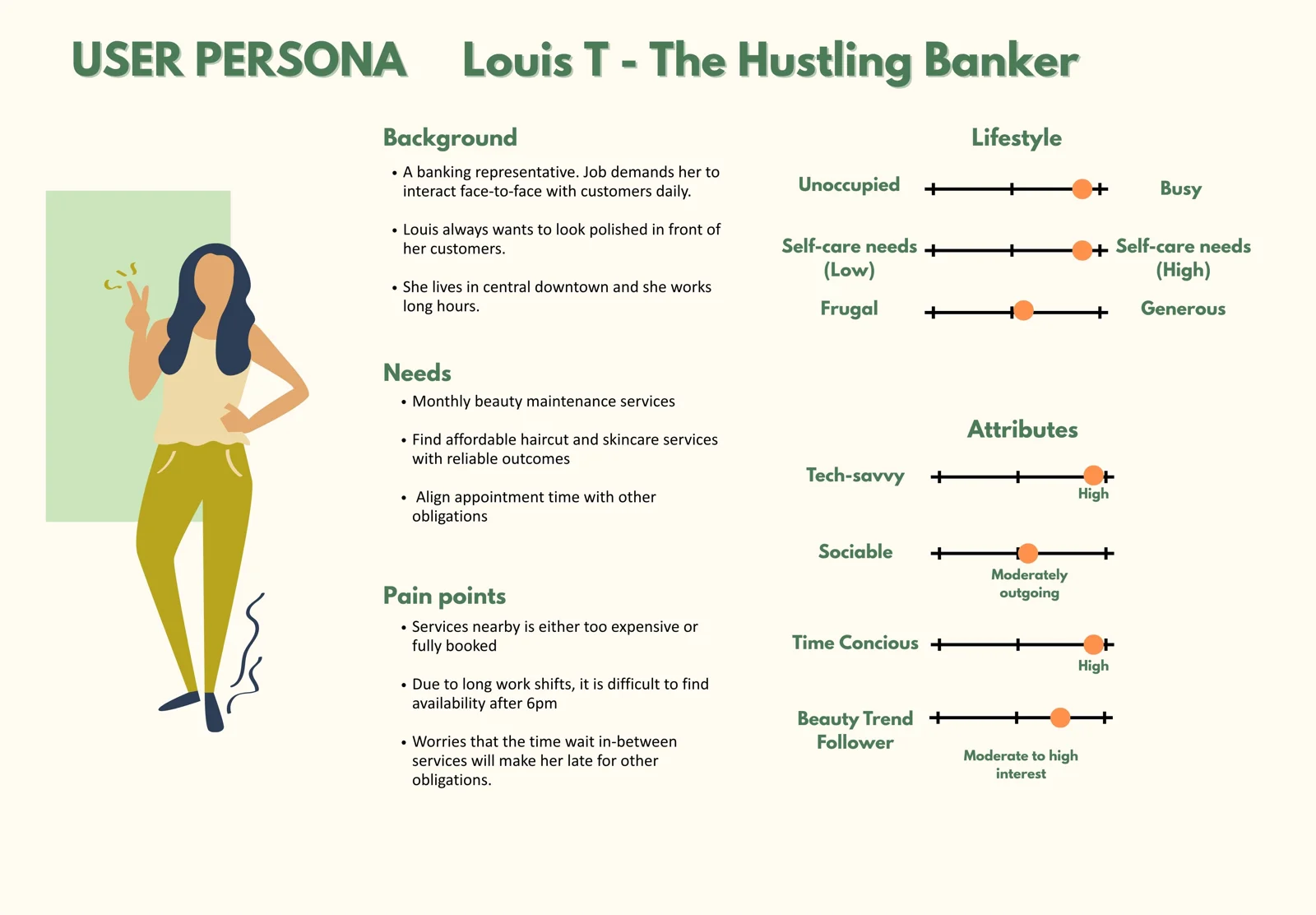
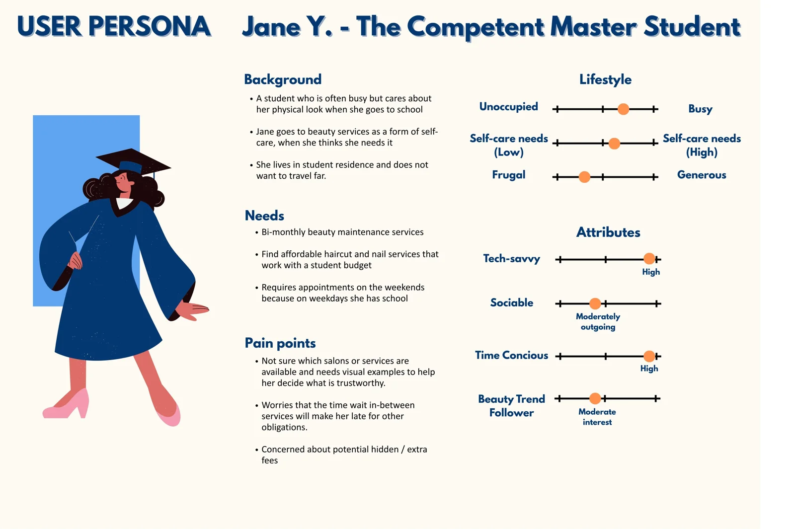
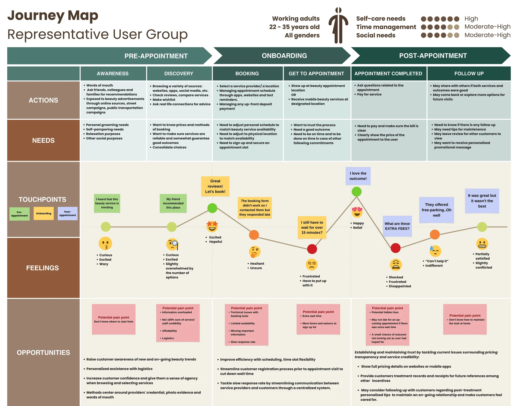
I led the creation of user personas and user journey map after analyzing the interview data. Here are our core takeaways:
- Booking behaviour is not homogenous, users approach it very differently.
- Users need to feel confident the providers respect their time and quality of service.
DESIGN
Brainstorming
Building Flexible Flows for Varied Booking Needs
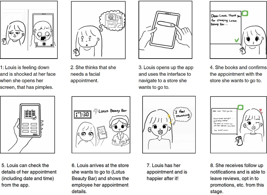
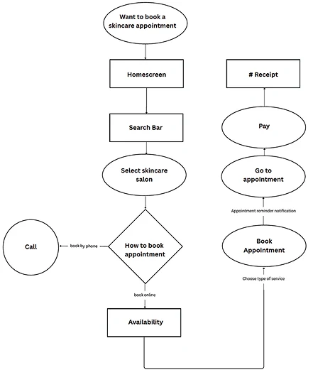
Since our user paths are not homogenous, we selected one type of beauty service to consolidate a user task flow and began to build new features around it. This way we were able to adapt our design directions to appeal to different ways of bookings and searchings.
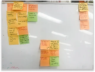
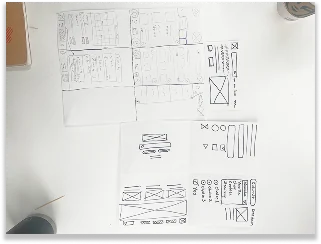
Three Major Design Opportunities Were Identified
1
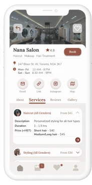
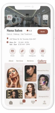
High Cognitive Load in Service Discovery and Store Detail Layout
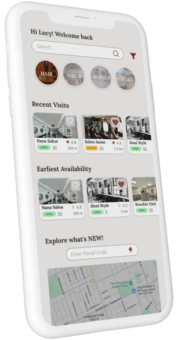
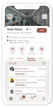
Users struggle to quickly understand salon availability and key information due to a dense, text-heavy interface and cluttered page structure. Important decision-making elements like services, reviews, map, and booking actions are buried, requiring excessive scrolling and increasing decision fatigue.
2
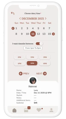
Lack of Time-Aware Filtering for Appointment Selection
Users experience difficulty finding suitable appointment times due to scattered availability and no way to align bookings with their personal schedule upfront, leading to inefficient and frustrating selection processes.
3
Low Booking Transparency and Poor Appointment Tracking Across Platforms
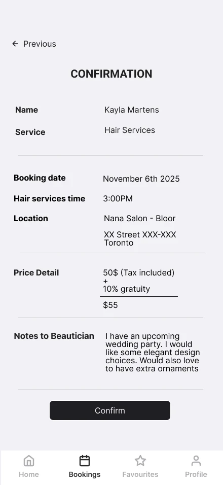
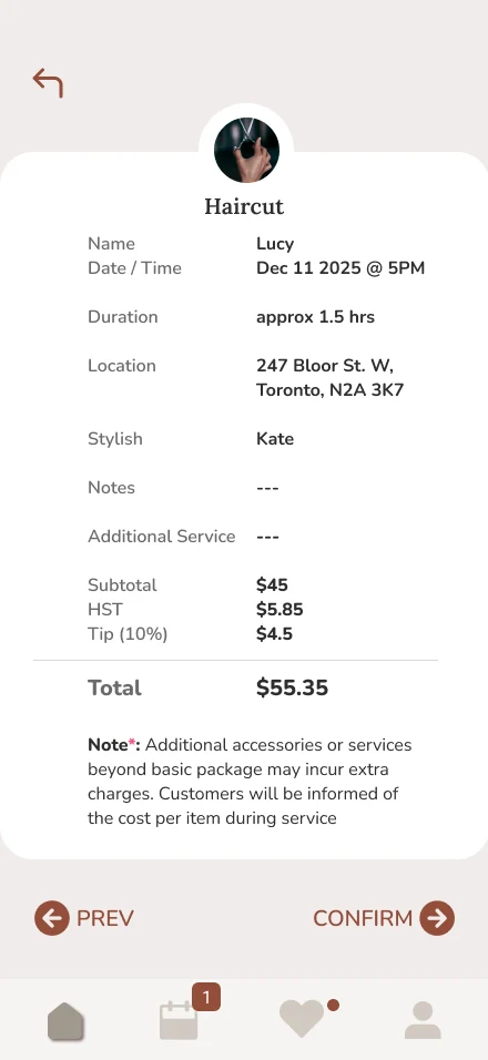
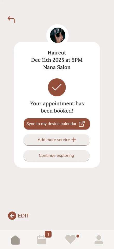
Users lose track of information entered during the booking flow, only seeing a full summary at the end, which reduces confidence and control. They also struggle to manage bookings alongside external calendars, making it difficult to stay organized across multiple commitments.
Iterative Prototyping
Connecting Research to the Final Experience
Design Iteration
Making Availability Visible and Navigation Effortless
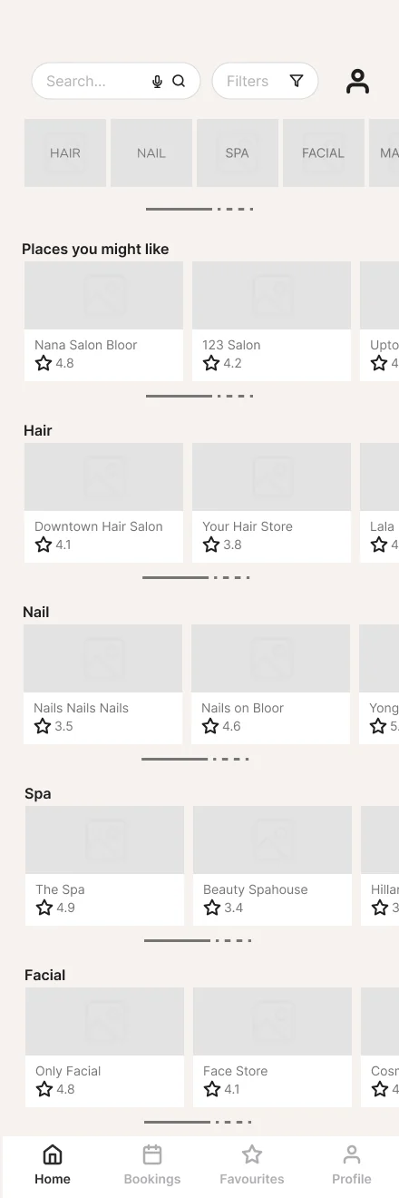
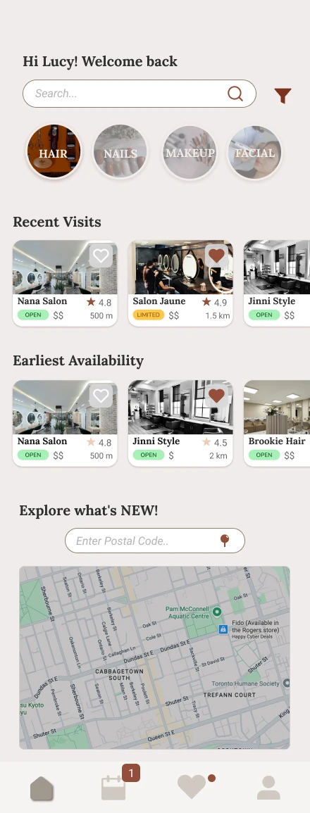
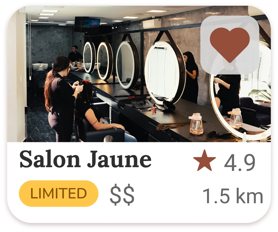
We introduced real-time availability badges (Open / Limited / Full) alongside key decision signals like distance, ratings, and price range. We also reorganized the homepage and added a service map to reduce clutter and speed up navigation.
Design Iteration
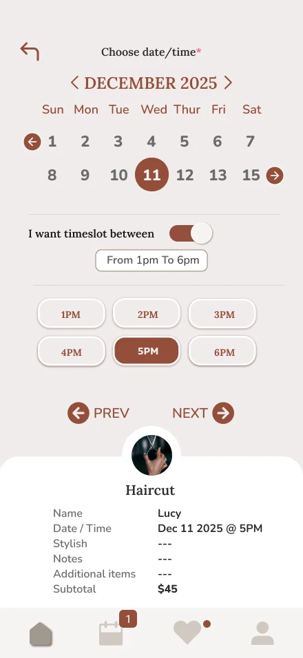
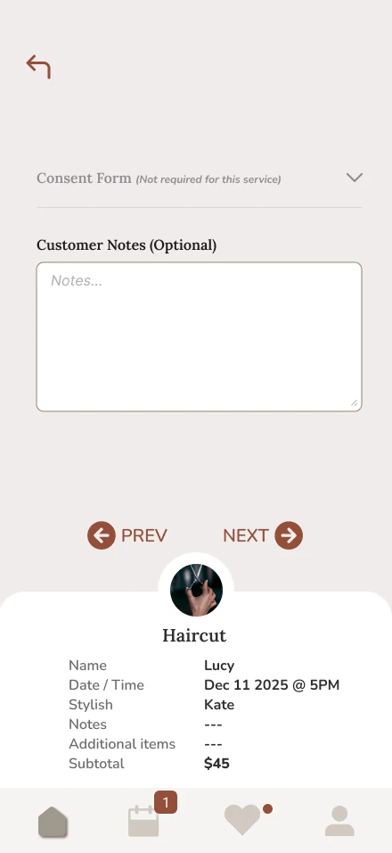
Reducing Check-In Friction Through Pre-Appointment Input
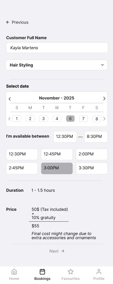
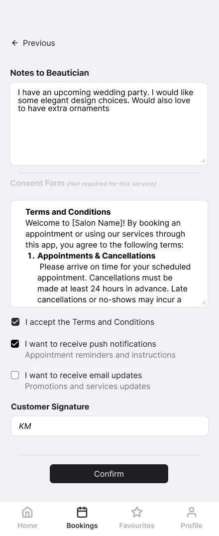
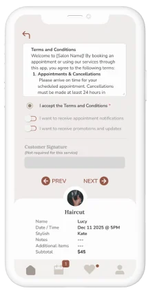
To address this, users can input their availability for a chosen day to filter relevant time slots and reduce search effort. Additionally, required forms for specialized treatments can be completed in advance, streamlining check-in and minimizing in-person delays.
Design Iteration
Keeping Users Oriented Throughout the Booking Process
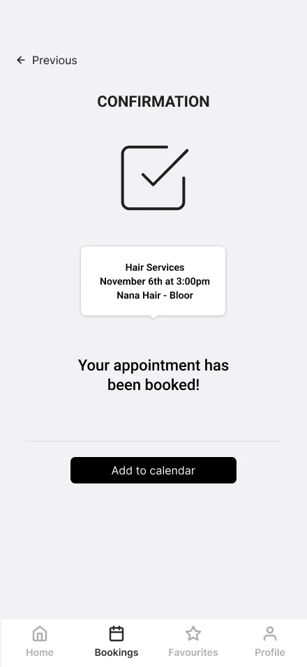
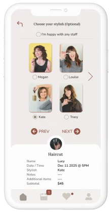
A persistent pull-up appointment summary updates in real time and can be accessed at any point for quick review and confirmation. Users can also sync their booking to external calendar apps to better manage multiple commitments across platforms.
OUTCOME
Final Design Outcome
Project Impact
Design Improvements Across Key Experience Areas
Across iterations, the design improvements focused on three key outcomes: improving clarity of availability, reducing cognitive load in discovery, and increasing transparency throughout the booking flow. Real-time availability indicators and structured filtering helped users make faster and more confident decisions, while interface restructuring reduced visual overload and improved navigation efficiency. The introduction of a persistent appointment summary further supported continuity, allowing users to stay oriented throughout the booking process.
Improved Clarity, Control, and User Confidence
Based on usability testing feedback, these changes improved perceived clarity and control, with participants expressing greater confidence in understanding service availability and navigating booking steps. While this project remains a prototype, the design decisions collectively demonstrate a more streamlined, user-centred booking experience that reduces friction across the entire journey.
Reflection & Future Improvements
This project is a strong representation of my UX process, from research synthesis to final prototype development. However, I also recognize areas for improvement in how I structure and communicate design decisions more concisely throughout the process. In future projects, I want to improve:
- Clearer documentation of decision-making tradeoffs during iteration
- More explicit linkage between research insights and final UI changes
- Stronger prioritization of features based on user impact rather than exploratory breadth